
Ciao a tutti!
In questo post farò un’analisi sintetica di come fare il color grading in Lightroom sfruttando un’uscita fotografica di Gennaio, quando ancora era freddo e si indossavano strati e strati di vestiti (sperando che diano un pò di refrigerio morale in queste giornate afose di Giugno).
Hello everyone!
In this post, I will provide a brief analysis of how to do color grading in Lightroom using a photo outing from January, when it was still cold, and we wore layers and layers of clothing (hoping it provides some moral relief during these hot June days).


Partiamo quindi dall’argomento principale ovvero, cos’è il color grading e che differenza c’é con la color correction? ho provato a porre questa domanda a Chat GPT 4.0 (che fai te ne privi della AI?) e questa è la sua risposta:
Il color grading è un processo più creativo e avanzato rispetto alla color correction nella post-produzione di fotografie e video. Mentre la color correction si concentra principalmente sull’aggiustamento dei colori per farli apparire naturali e coerenti con la realtà, il color grading mira a manipolare i colori per creare un particolare stile, atmosfera o emozione nell’immagine o nel video.
Let’s start with the main topic: what is color grading, and how does it differ from color correction? I tried asking this question to Chat GPT 4.0 (how could you miss out on AI?), and this is the response:
Color grading is a more creative and advanced process compared to color correction in the post-production of photos and videos. While color correction focuses mainly on adjusting colors to make them appear natural and consistent with reality, color grading aims to manipulate colors to create a particular style, atmosphere, or emotion in the image or video.
Ora che è chiara questa differenza, posso dire che il mio intendo sia dell’uscita fotografica che quello del color grading era quello di far si che le luci fossero essenziali per dare risalto solo al soggetto rappresentando la quotidianità di una città la sera, quando fa buio.
Now that this difference is clear, I can say that my intention for both the photo outing and the color grading was to make the lights essential in highlighting only the subject, representing the everyday life of a city in the evening, when it gets dark.


Ma ora basta teoria e spiegazioni, veniamo alla pratica e apriamo Lightroom e scopriamo i due pannelli con i quali ho lavorato per creare questo effetto (troverete il link per scaricare questo preset a fine articolo).
But enough theory and explanations, let’s get to practice. Let’s open Lightroom and discover the two panels I worked with to create this (you can find the download link for this preset at the end of the post).
TECNICA
TECHNIQUE
Una volta fatte le correzioni base alla foto, quindi bilanciamento bianco, contrasto, esposizione ecc, ho deciso di lavorare esclusivamente con 2 pannelli di Lightroom per ricavarmi questo mood stilistico, ovvero il pannello Color grading e il pannello Calibrazione.
Once I made the basic corrections to the photo, such as white balance, contrast, exposure, etc., I decided to work exclusively with two Lightroom panels to achieve this stylistic mood: the Color Grading panel and the Calibration panel.
Partiamo dal pannello Color grading che è quello che in questa spiegazione prenderà un pò più di tempo.
Il pannello Color grading va ad agire sui toni (luci, ombre e mezzitoni), non sui colori o altro, tenete bene a mente questo dettaglio.
Passiamo alle zone di intervento che sono 4: Mezzitoni, Luci, Ombre e Globale. Se qualcuno di voi non ha mai visto il controllo Globale, la troverete cliccando sul cerchietto di destra in alto (dove ci sono i cerchietti per avere la visualizzazione dei singoli canali di intervento o la visualizzazione dei 3 regolatori assieme).
Let’s start with the Color Grading panel, which will take a bit more time to explain.
The Color Grading panel affects the tones (highlights, shadows, and midtones), not the colors or anything else, so keep this detail in mind.
There are four areas of intervention: Midtones, Highlights, Shadows, and Global. If you haven’t seen the Global control before, you’ll find it by clicking on the rightmost circle at the top (where the circles are for viewing individual channels or all three controllers together).
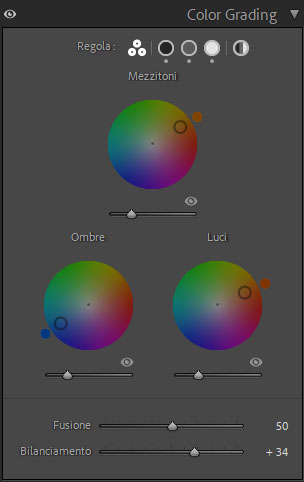
Ma la regolazione Globale che cos’e? è la stessa cosa del bilanciamento del bianco? NO! decisamente NO! il bilanciamento del bianco interviene sui colori mentre la regolazione Globale sarebbe come aggiungere una pellicola colorata sopra la foto per dare quel tono globale alla foto. Quindi se volessi una foto con toni più caldi o freddi non vado a cambiare il bilanciamento del bianco (che è la prima cosa che vado a regolare quando sistemo una foto e poi non tocco più), ma intervengo proprio sul canale Globale scegliendo la tonalità del colore che voglio dare e poi lavorando sugli altri parametri per regolarne l’intensità ecc (in questa occasione non ho toccato il parametro Globale perché avevo altre necessità stilistiche).
But what is Global adjustment? Is it the same as white balance? NO! Definitely NOT! White balance affects the colors, while Global adjustment is like adding a colored film over the photo to give it an overall tone.
So, if I want a photo with warmer or cooler tones, I don’t change the white balance (which is the first thing I adjust when editing a photo and then don’t touch again). Instead, I use the Global channel to choose the color tone I want and then adjust the other parameters to set its intensity, etc. (In this case, I didn’t touch the Global parameter because I had other stylistic needs).


Ora veniamo ai Mezzitoni, Luci e Ombre. Come vi ho detto prima, questi parametri non intervengono assolutamente sui colori, ma agiscono sui Bianchi, neri e grigi nell’ordine delle luci e ombre, per spiegarvi con un esempio. Se alle luci do una tonalità verde, si vedranno le luci essere influenzate dal colore verde, mentre le ombre no. Se poi dal parametro HSL ( Mixer colori ) vado a cambiare la luminanza, saturazione o tonalità del verde, queste non avranno effetto, proprio perché HSL interviene sui colori della foto, degli oggetti in foto, mentre il Color grading interviene su toni della foto, quindi anche in questo caso, come per il parametro Globale, è come se si regolasse un livello a parte, quindi familiarizzate bene con questo concetto, altrimenti si finirà per fare regolazioni e non riuscire ad ottenere ciò che si ha in testa (un consiglio per fare pratica: usate una foto in bianco e nero e provate a usare il pannello HSL (Mixer colori) e quello del Color grading).
Now let’s move on to Midtones, Highlights, and Shadows. As I mentioned earlier, these parameters do not affect colors but act on the whites, blacks, and grays in the order of highlights and shadows. To explain with an example: if I give a green tone to the highlights, the highlights will be influenced by the green color, while the shadows will not. If I then change the luminance, saturation, or hue of the green in the HSL (Color Mixer) parameter, these adjustments will have no effect because HSL affects the colors of the photo, the objects in the photo, while Color Grading affects the tones of the photo. So, as with the Global parameter, it’s like adjusting a separate layer. Familiarize yourself with this concept; otherwise, you’ll end up making adjustments without achieving what you have in mind (a tip for practice: use a black-and-white photo and try using the HSL (Color Mixer) panel and the Color Grading panel).
I regolatori per Ombre Luci e Mezzitoni sono abbastanza semplici. Se usate la visualizzazione classica con tutti e 3 i cerchietti visibili (come da foto) capirete che potrete selezionare il tipo di tonalità colore e saturazione con il cerchietto, mentre con la barretta sotto regolerete la luminanza (nei parametri a visualizzazione singola avrete gli slider separati idem per il Globale) mentre a fondo troveremo 2 slider con Fusione e Bilanciamento.
Fusione io la tocco raramente, ma in pratica piu è bassa piu gli stacchi tra i parametri (luci, ombre e mezzitoni) saranno netti, più è alto più gli stacchi saranno morbidi ma risulterà meno difficile notare differenze tra i vari toni.
Bilanciamento, regoli se vuoi aumentare la quantità di luci o di ombre e quindi far prevalere una delle due caratteristiche nella foto. Ma come funziona esattamente? in pratica rende i neri meno neri e i bianchi meno bianchi facendoli virare sui grigi in modo tale che possano essere influenzati nella variazione di tonalità colore, perché sia il nero che il bianco non possono avere tonalità di colore, loro sono nero e bianco e basta.
The controllers for Shadows, Highlights, and Midtones are quite simple. If you use the classic view with all three circles visible (as in the photo), you can select the type of color tone and saturation with the circle, while the bar below adjusts the luminance (in the single-view parameters, you’ll have separate sliders, the same for Global). At the bottom, you’ll find two sliders for Blending and Balance.
I rarely touch Blending, but in practice, the lower it is, the more distinct the separations between the parameters (highlights, shadows, and midtones); the higher it is, the smoother the transitions, making it less noticeable between different tones.
Balance adjusts if you want to increase the amount of highlights or shadows, thereby emphasizing one of the characteristics in the photo. But how does it work exactly? It makes blacks less black and whites less white, turning them into grays so that they can be influenced by color tone variations because neither black nor white can have color tones; they are just black and white.


Ecco, questo è il pannello Color Grading spiegato alla veloce e in modo semplice. Ora veniamo al pannello Calibrazione, ma questo sarà ancora più semplice e veloce da spiegare.
Here, this is the Color Grading panel explained quickly and simply. Now let’s move on to the Calibration panel, which will be even simpler and quicker to explain.
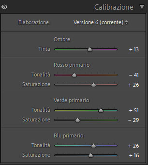
Il pannello Calibrazione bisogna considerarlo come teoria di intervento allo stesso modo di HSL (o pannello Mixer colori) solo che lavora in modo un pelo differente agendo su macro aree intervenendo come Ombre o sui colori Rosso Verde e Blu. Questo non andrà ad influire sulle regolazioni fatte nel pannello Color grading, ma sui colori degli oggetti nella foto.
The Calibration panel should be considered in the same way as the HSL (or Color Mixer) panel, but it works slightly differently by acting on macro areas such as Shadows or the Red, Green, and Blue colors. This won’t affect the adjustments made in the Color Grading panel, but it will affect the colors of the objects in the photo.
L’utilizzo è molto semplice se si capisce come lavora.
Partiamo con lo slider Ombre, se proverete, con quello potrete dare un tono alle ombre (che potremmo considerare i grigi) tra il verde e il viola, molto semplice.
Per gli altri slider si potra variare quel canale colore seguendo lo slider, ovvero il Rosso potremmo farlo variare facendolo diventare tra il rosso/violaceo e giallo, mentre il Verde lo potremmo virare su toni che vanno dal giallo al verde/blu e il Blu dal verde al viola (ovviamente ho detto i colori in modo approsimativo) mentre con lo slider della saturazione, decideremo la quantità di colore che devono avere.
Using it is very simple once you understand how it works.
Let’s start with the Shadows slider: with it, you can give a tone to the shadows (which we could consider the grays) between green and purple, very simple.
For the other sliders, you can vary that color channel following the slider. For example, you can make Red vary between red/purple and yellow, while Green can be shifted to tones ranging from yellow to green/blue, and Blue from green to purple (obviously, I approximated the colors). With the saturation slider, you can decide the amount of color they should have.


Qui vi mostro i prima e dopo gli interventi e saranno il file RAW assieme al file con le correzioni del pannello Base e l’altra sarà la foto Base con solo gli interventi del Color grading o della Calibrazione. A parte troverete la foto finale.
Here I show you the before and after of the adjustments: the RAW file along with the file with the Base panel corrections, and another will be the Base photo with only the adjustments from Color Grading or Calibration. Separate, you will find the final photo.


PS: fate attenzione che io stesso quel preset non l’ho usato allo stesso identico modo su tutte le foto, ma ogni tanto ho dovuto fare delle microregolazioni per avere il mood desiderato, soprattutto perché non tutte le luci reagiscono allo stesso modo.
PS: be aware that I didn’t use that preset in exactly the same way on all the photos, but sometimes I had to make minor adjustments to achieve the desired mood, especially because not all lights react the same way.
Ora vi saluto, ci vediamo al prossimo articolo!
Stay Fresh°!
Now, goodbye, see you next time!
Stay Fresh°!


Lascia un commento